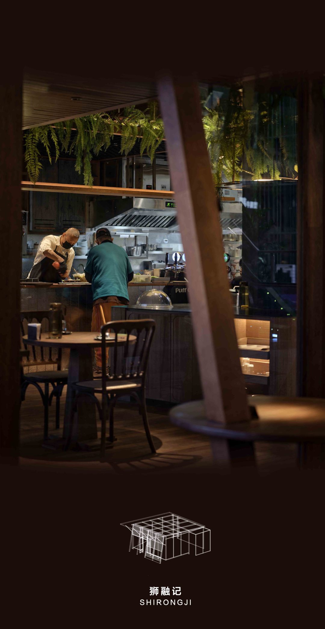
▼室内一览
overview of interior
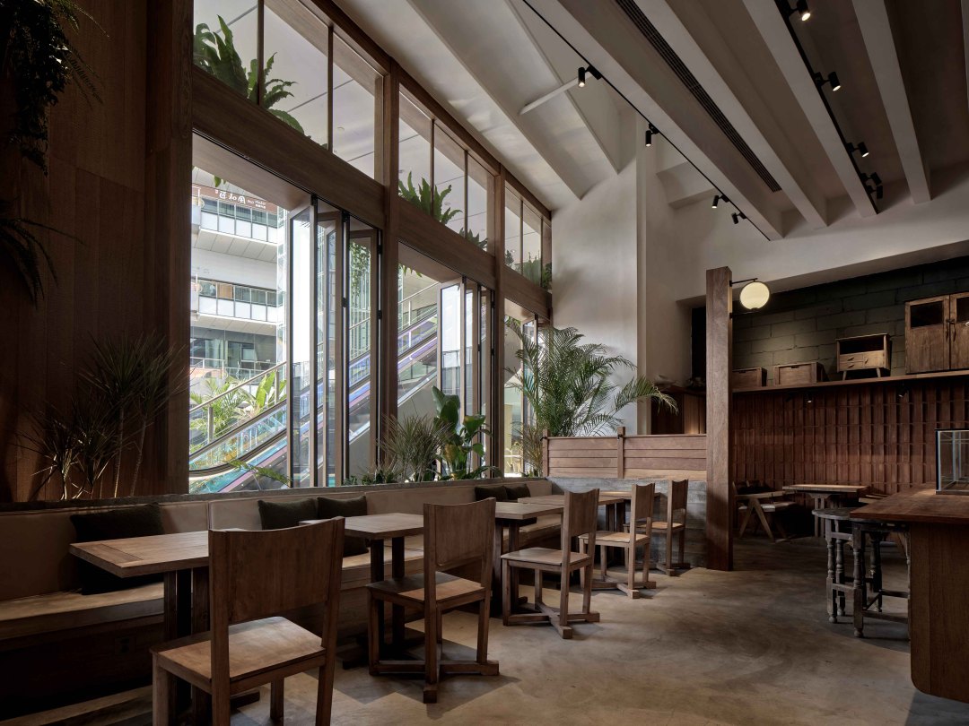
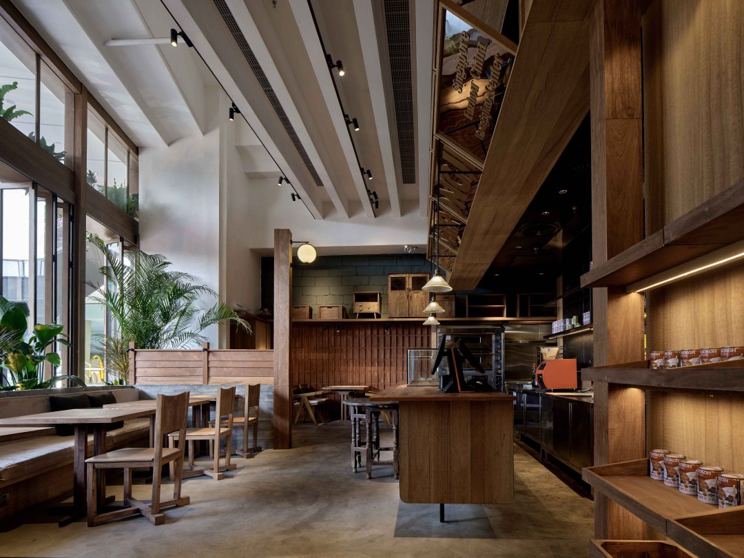
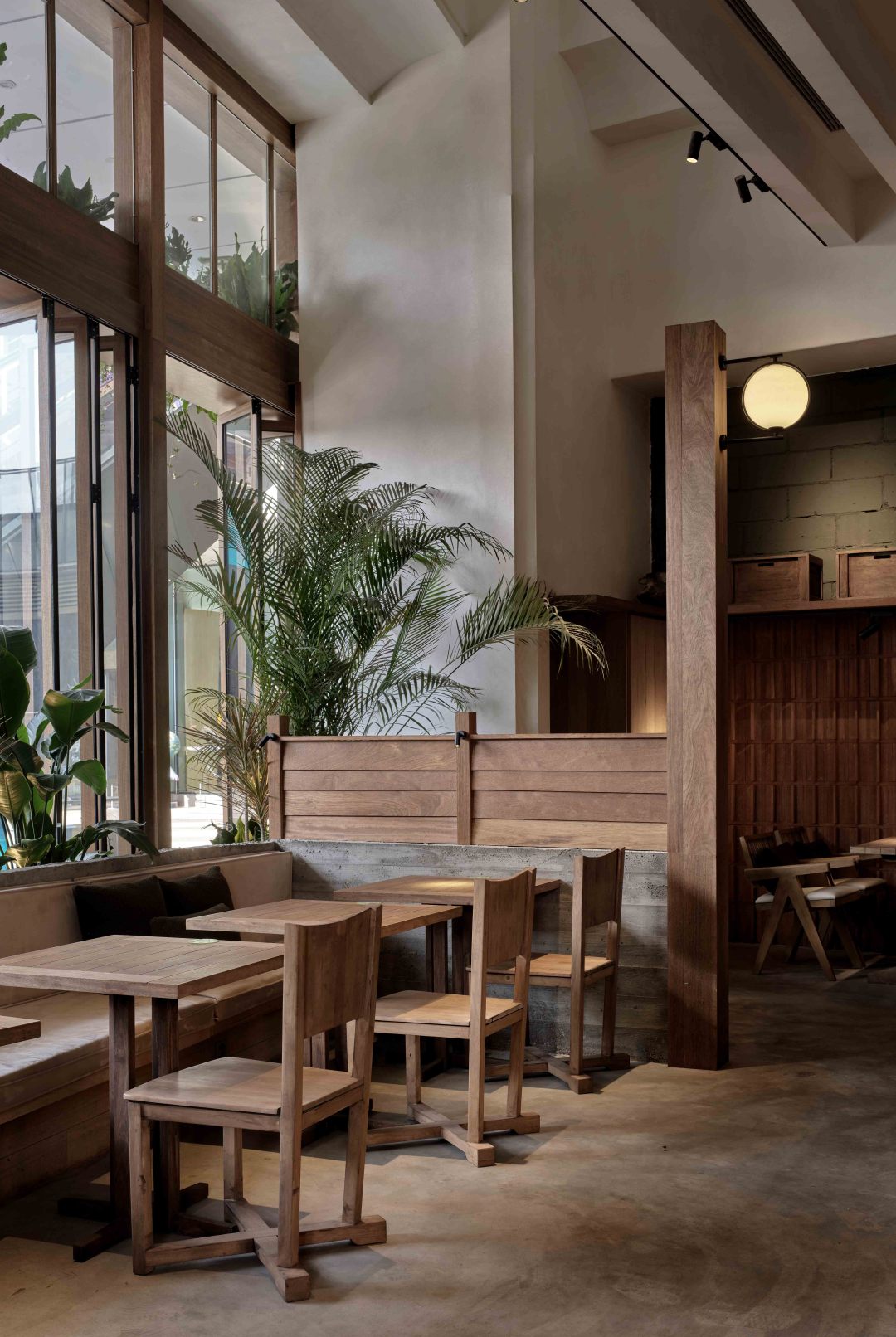
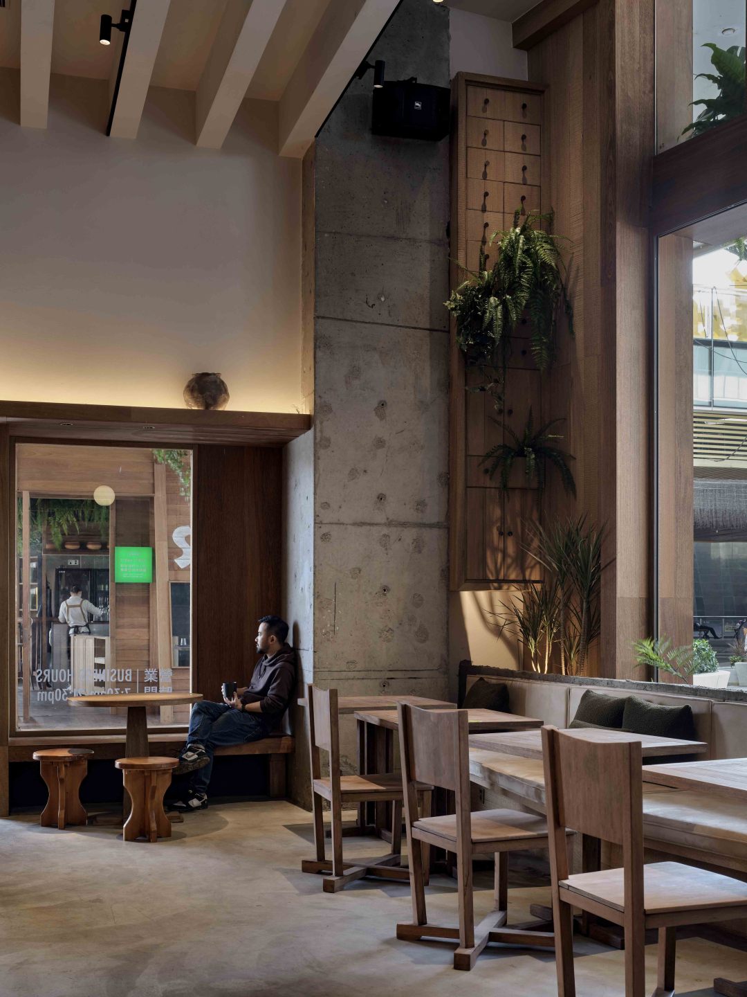
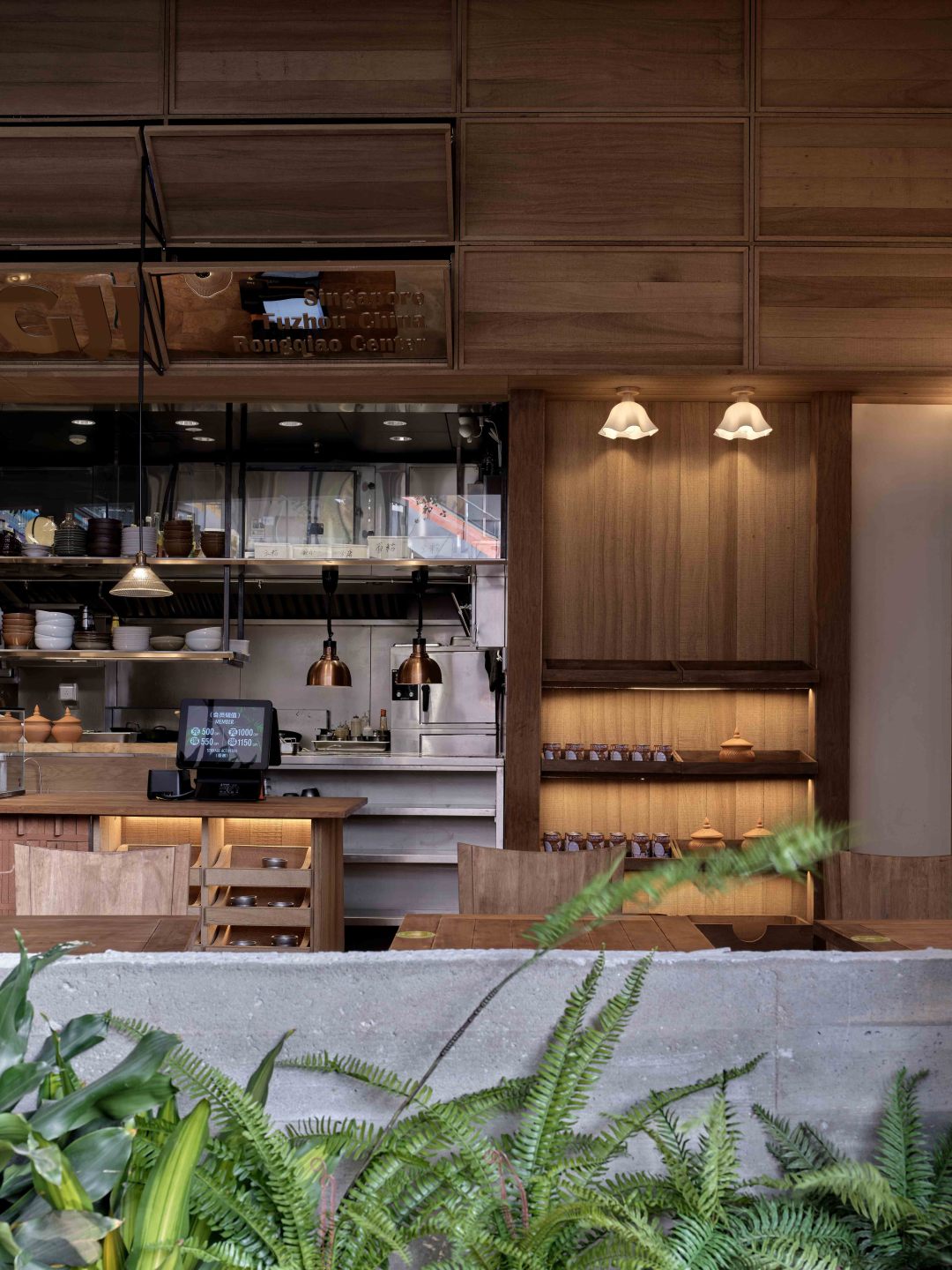
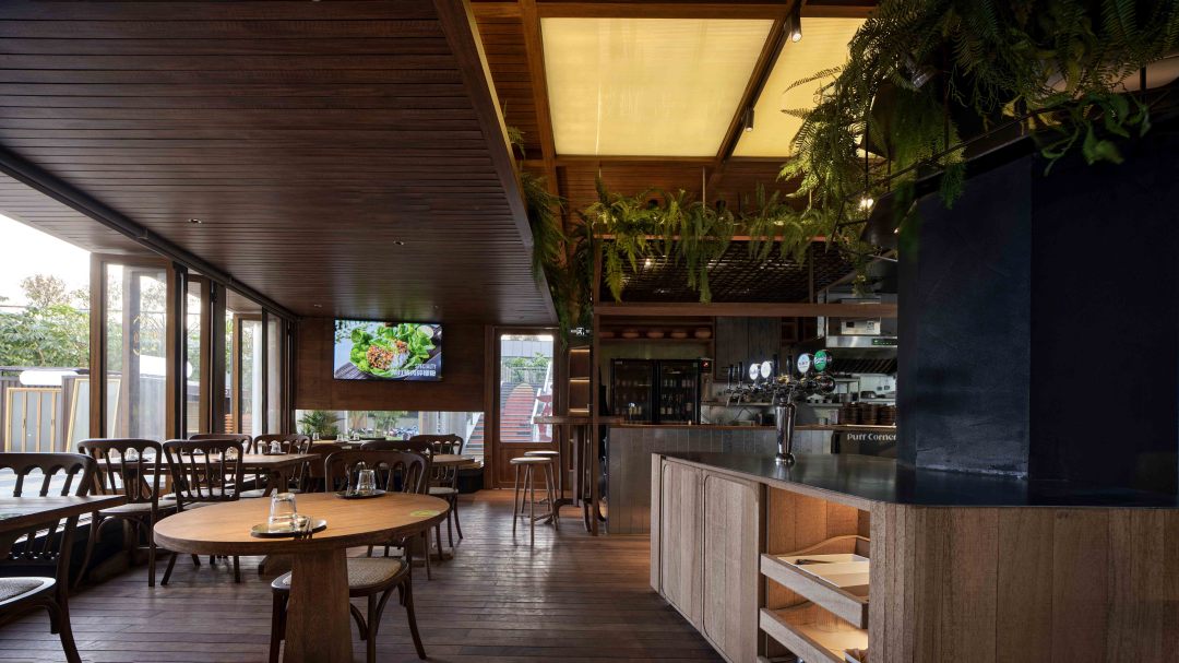
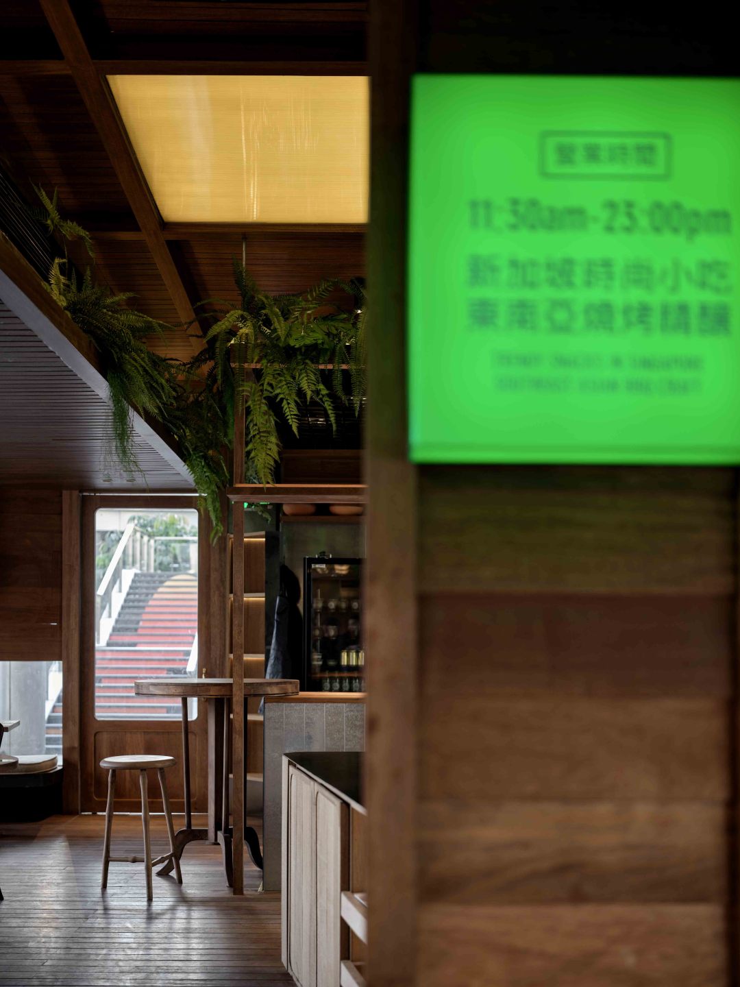
设计中充分利用原建筑层高上的优势,将区分不同区域的“路”,转而置于天花板之上,利用材质的变化叠加不同的层次,将用餐区与服务区隔开来的同时,让整体空间开阔且具有段落感。
In the design, the advantage of the height of the original building is taken full advantage of, and the "road" that distinguishes different areas is placed on the ceiling instead. The change of material is used to overlay different levels. While separating the dining area and the service area, the whole space is open and has the sense of paragraphs.
▼收银/蛋糕台
overview of cash
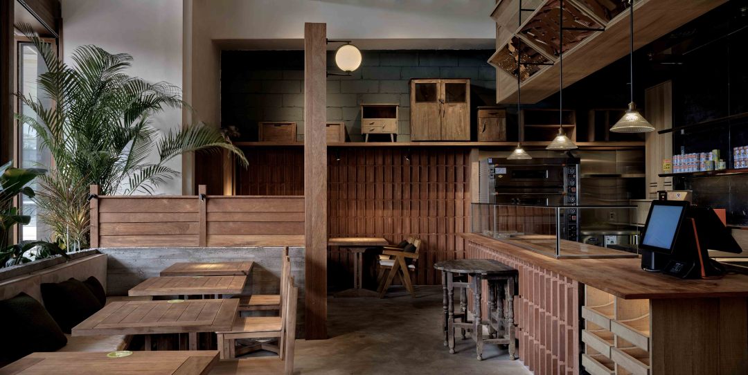
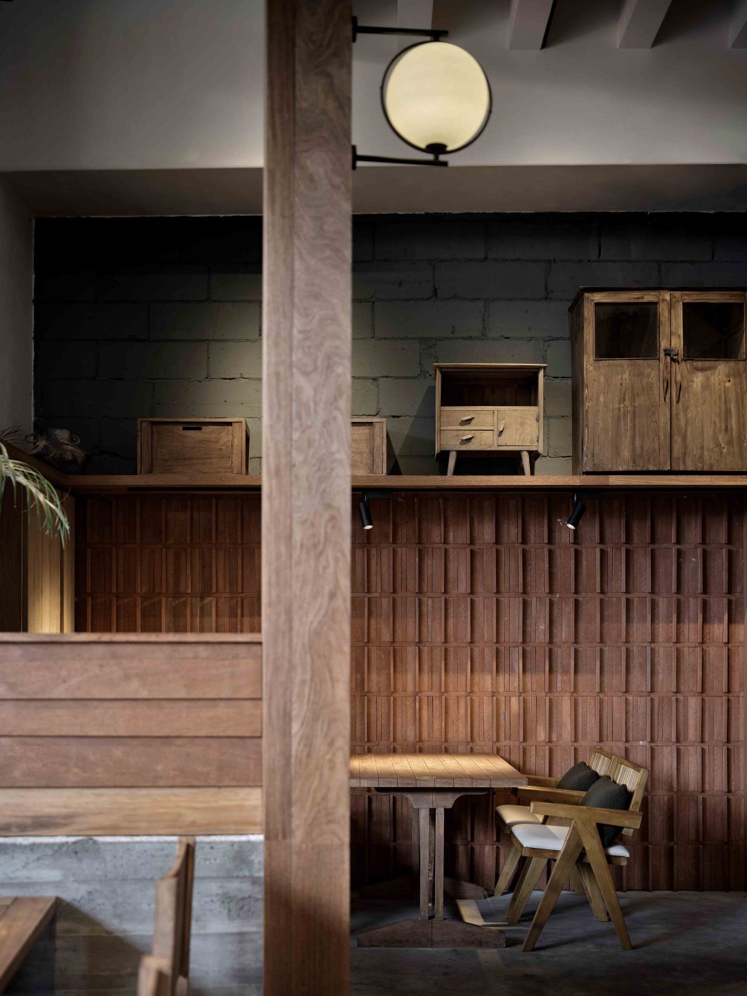
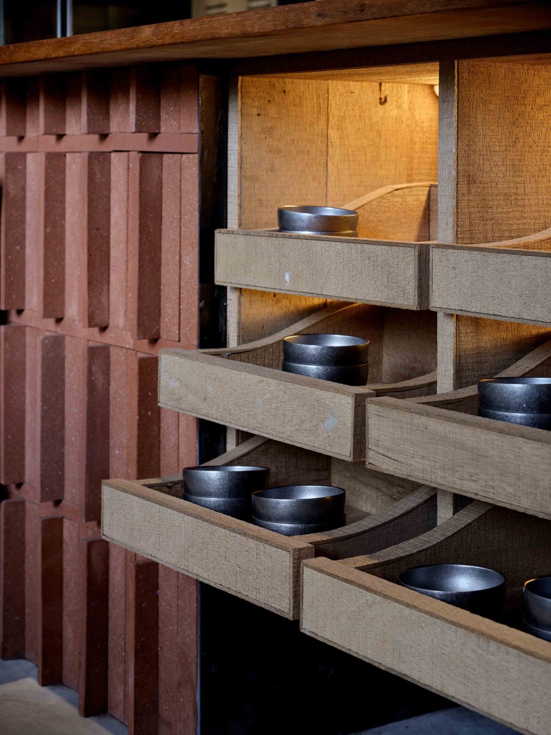
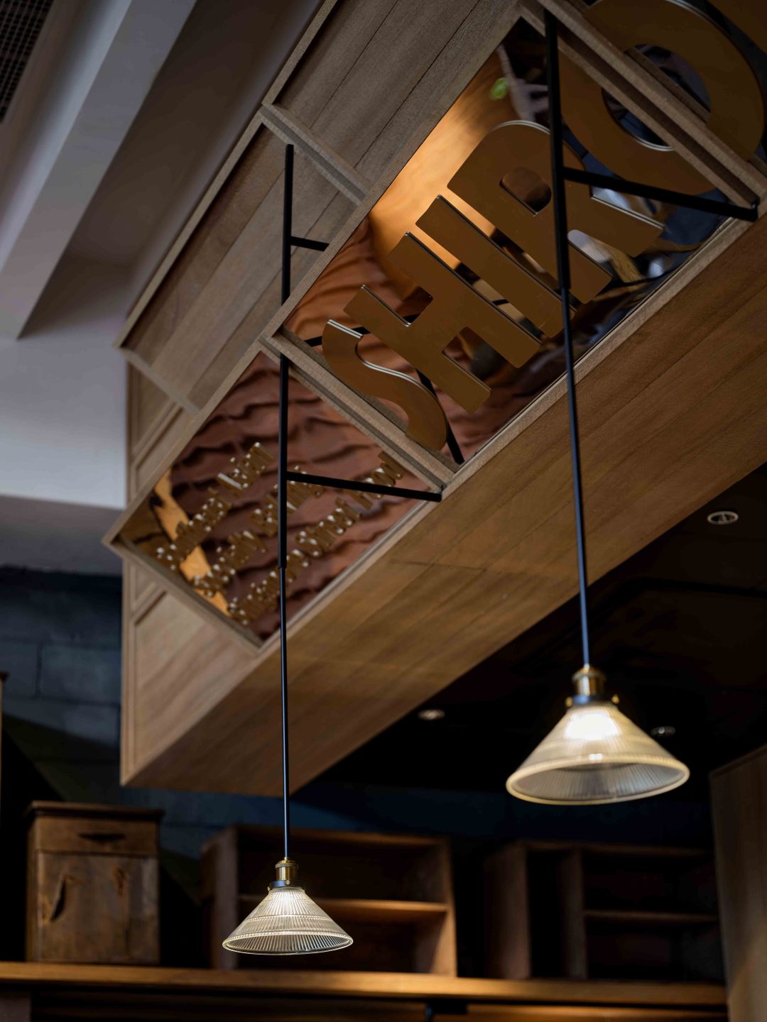
开放的岛台设置在整个空间的中心,集收银、甜品展示功能为一体。以一种“弱区隔”的形式,形成空间的向导,自然地成为了服务区与用餐区柔和的“分割线”。同时进一步打开了空间的自由度,空间的行为主体彻底让渡于人本身。
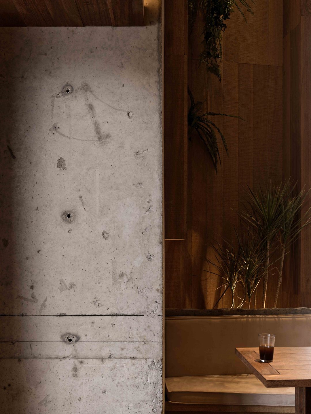
空间中以柚木色为主色调,木质的低调沉稳搭配上金属镜面反射,借由灯光蕴晕,让整个空间更为通透,营造出一种既森系又沉稳的街头休闲感。
The open island is set in the center of the whole space, integrating cashier and dessert display functions. In a form of "weak division", the guide of the space is formed, which naturally becomes the soft "dividing line" between the service area and the dining area. At the same time, the freedom of space is further opened, and the behavior subject of space is completely transferred to the human itself.
In the space, the teak color is the main color. The low-key and calm wood is combined with the metal mirror reflection. By the light, the whole space is more transparent, creating a sense of both forest and calm street leisure.
▼用餐卡座区
overview of booth
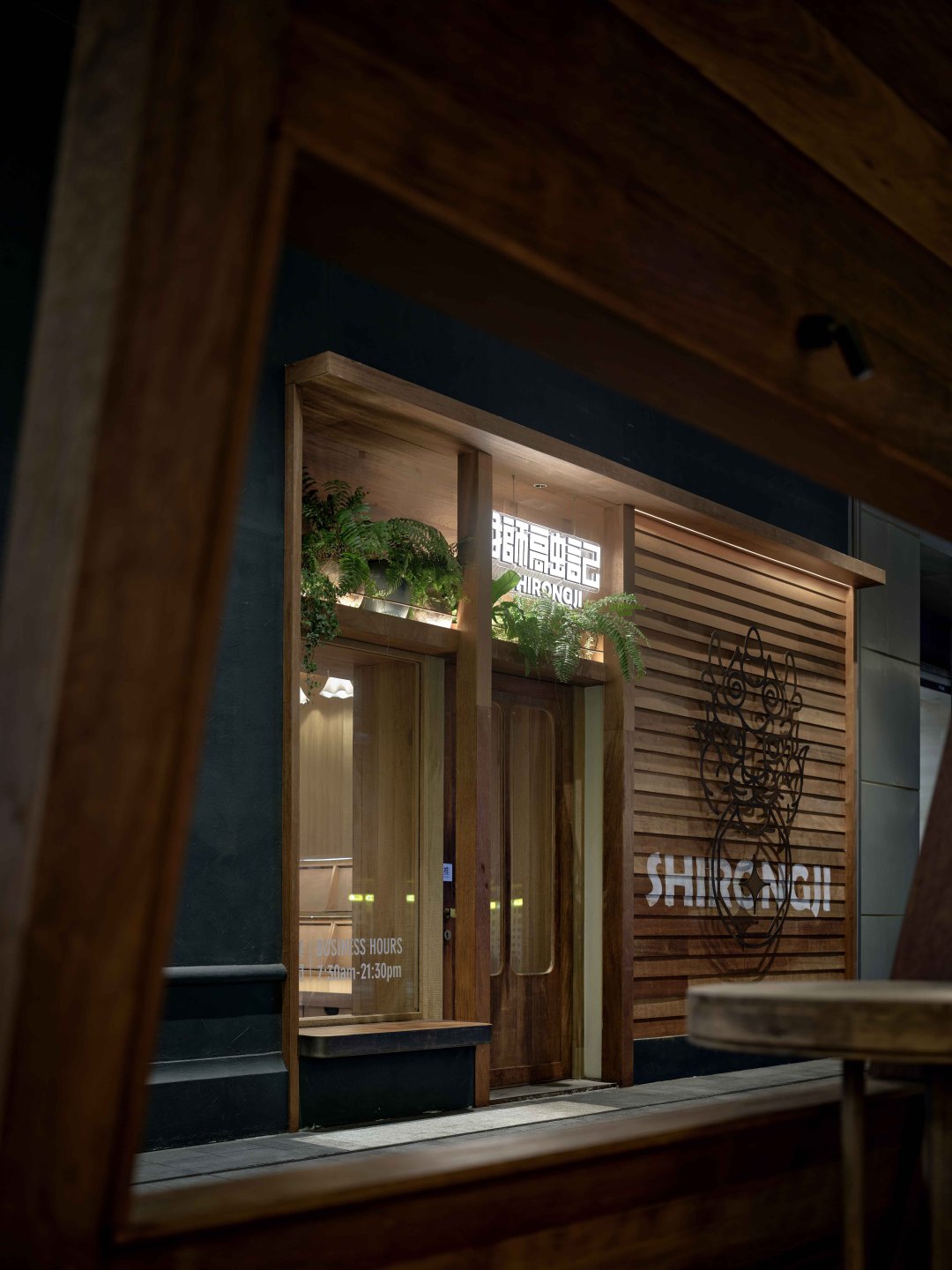
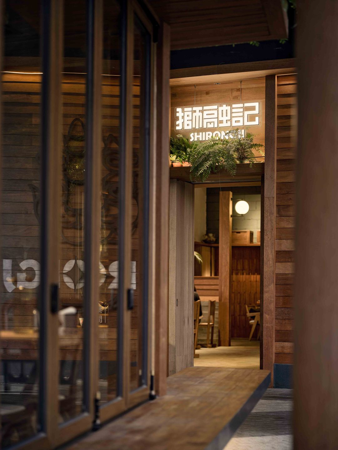
▼主入口外景
overview of enterance
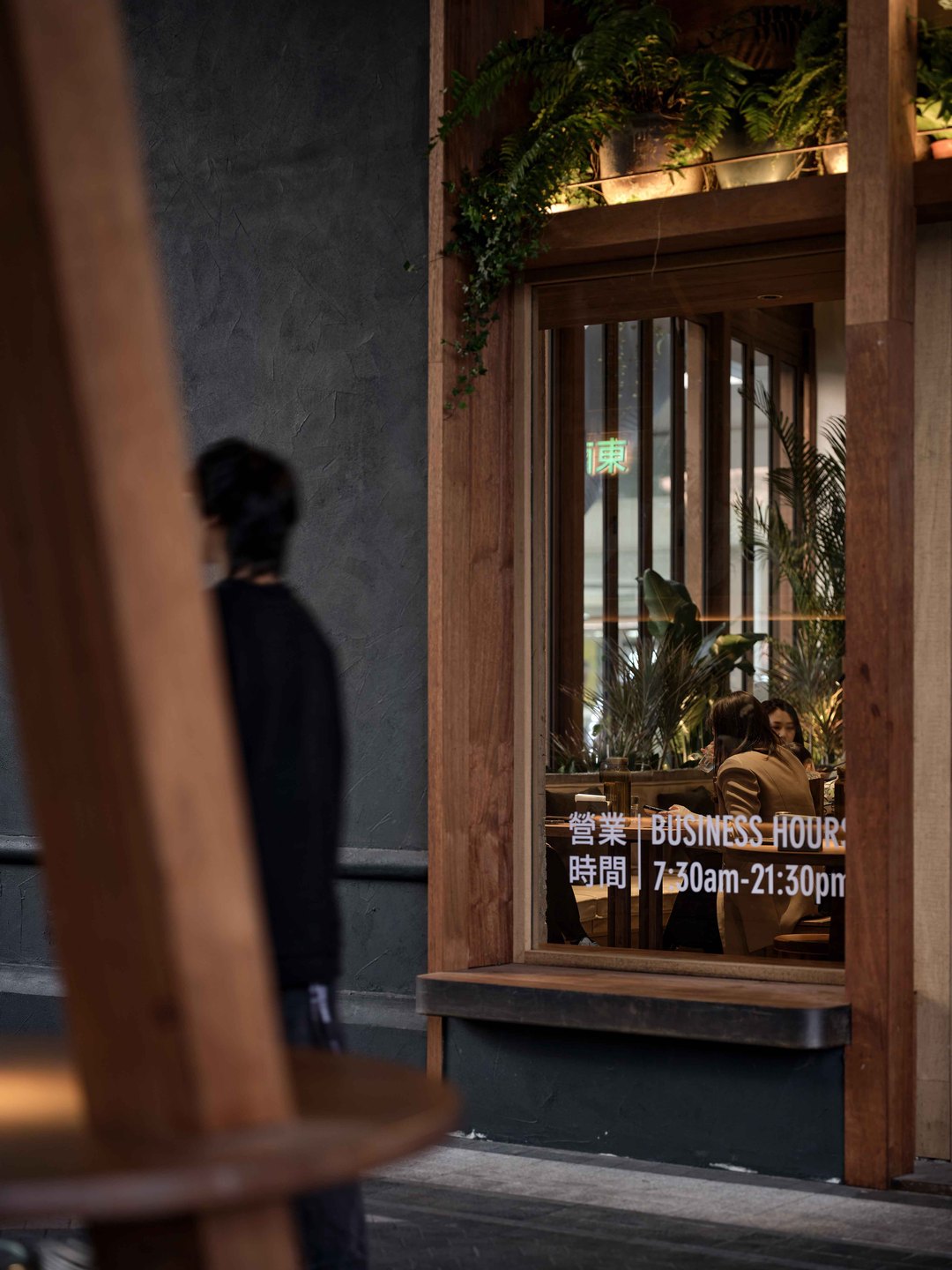
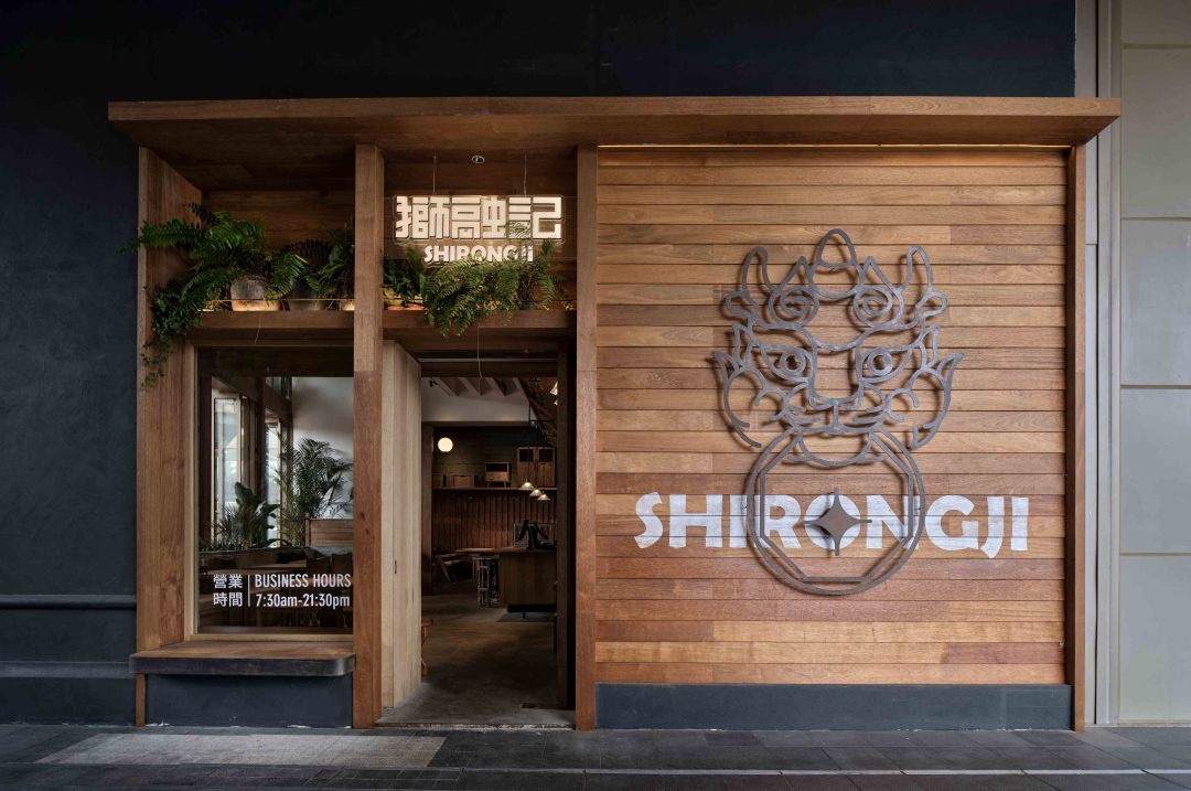
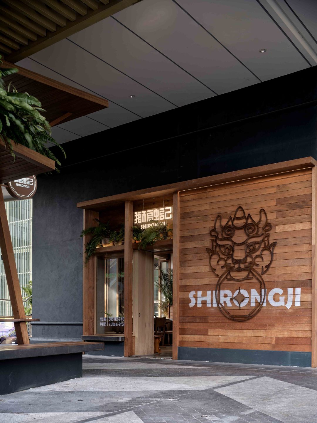
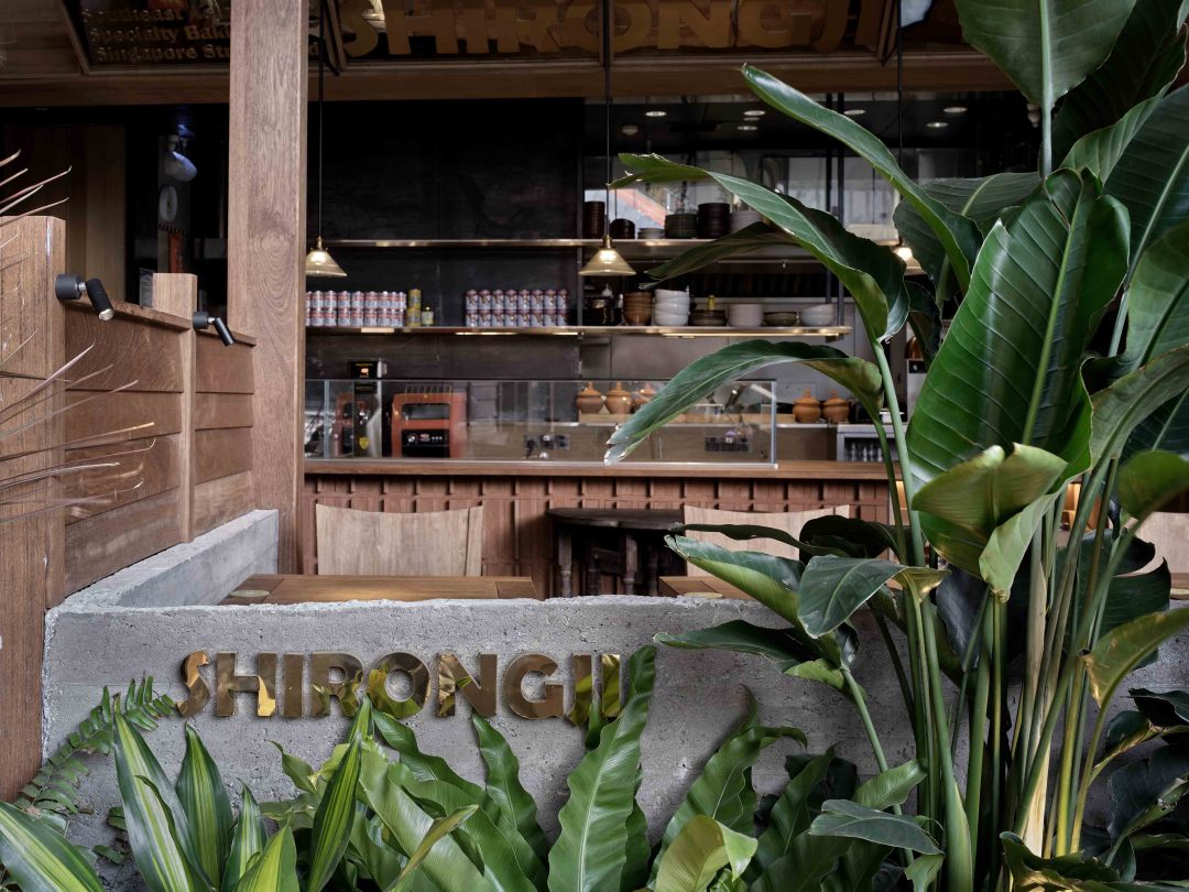
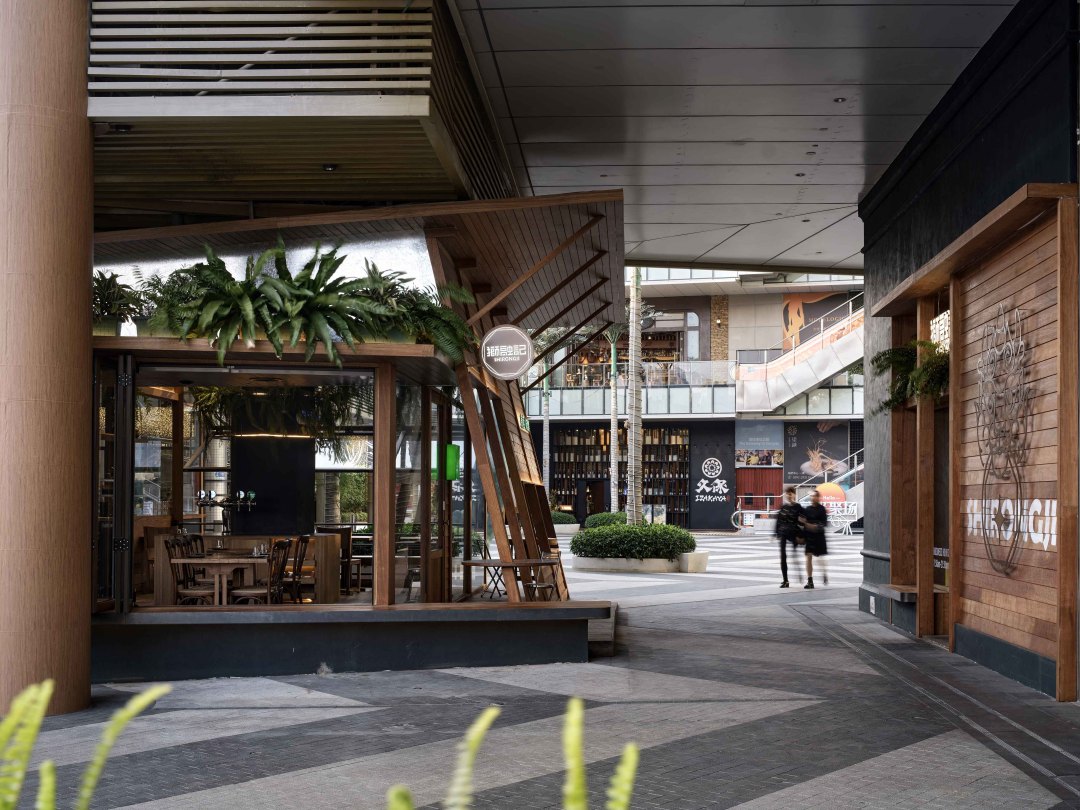
项目的特殊之处,在于室内区域与户外区域间隔着一条马路。因此在设计中,如何建立一个自然且开放的动线,以及如何更好地增加两个空间的联动性是我们重点需要考量的部分。
What makes the project special is that the indoor area is separated from the outdoor area by a road. Therefore, in the design, how to establish a natural and open moving line, as well as how to better increase the interaction between the two Spaces are the key parts we need to consider.
▼平面图
plan
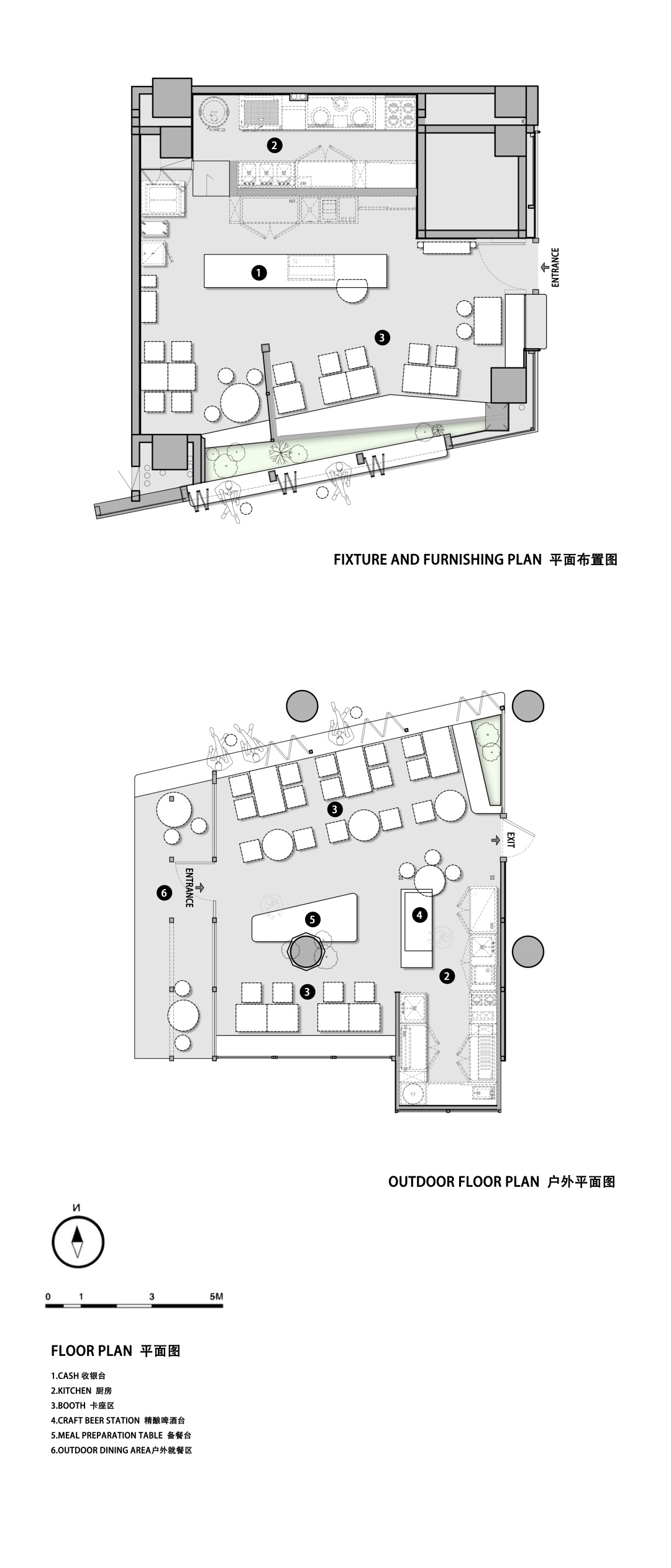
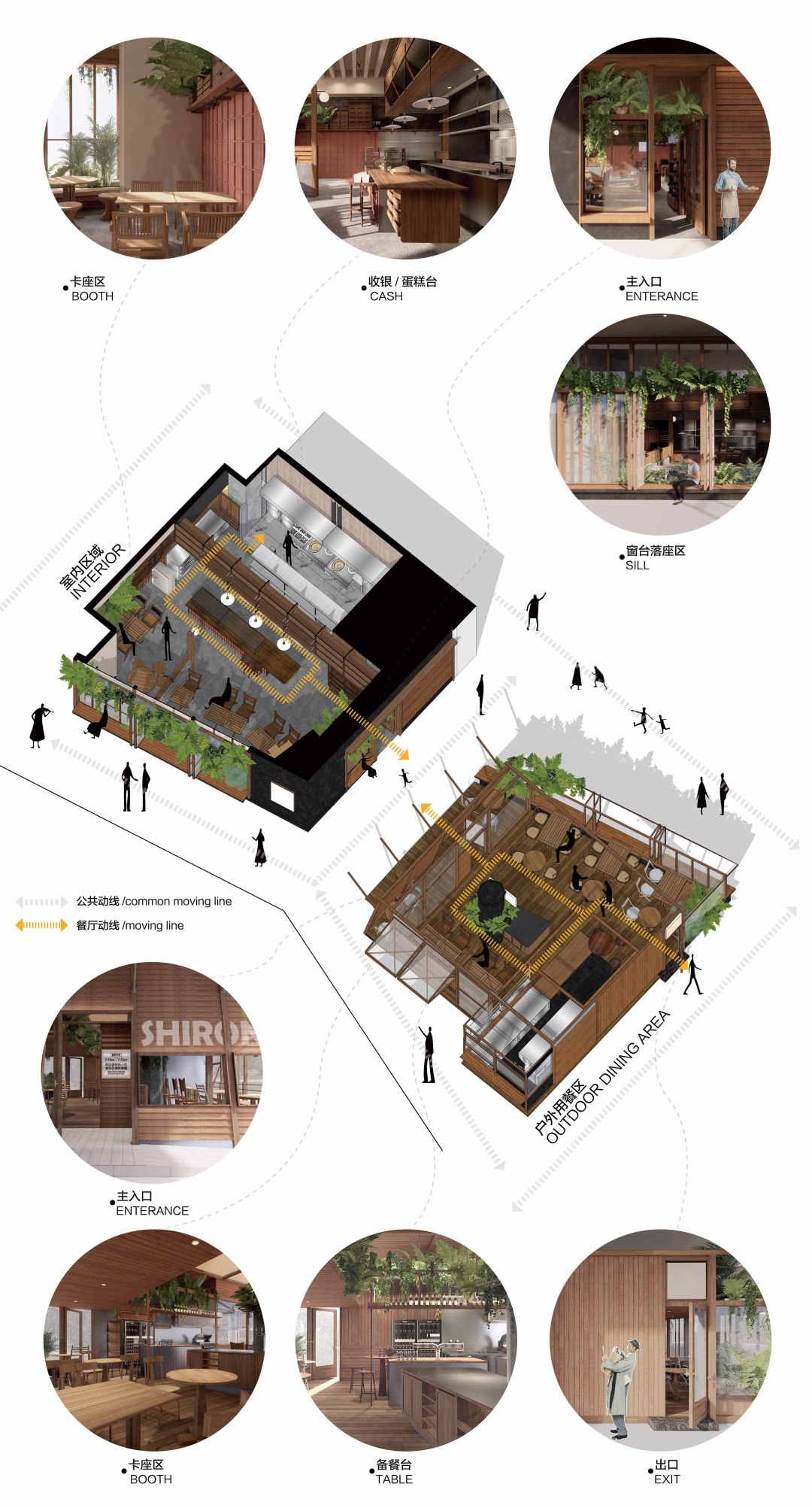
相对于室内区域的半开放状态,在户外区域的设计中,整个空间都是"打开"的,不以实质性的墙体去区隔。通过相同材质的运用和设计语言的引导,两个空间一紧一疏、一开一合,叠加不同的层次,将空间区域开来的同时,又增加了两个空间之间的联动性。
In contrast to the semi-open state of the interior area, in the design of the outdoor area, the whole space is "open", not separated by substantial walls. Through the use of the same material and the guidance of the design language, the two Spaces are tight, open and closed, superimposed with different levels. While the space is separated, the linkage between the two Spaces is increased.
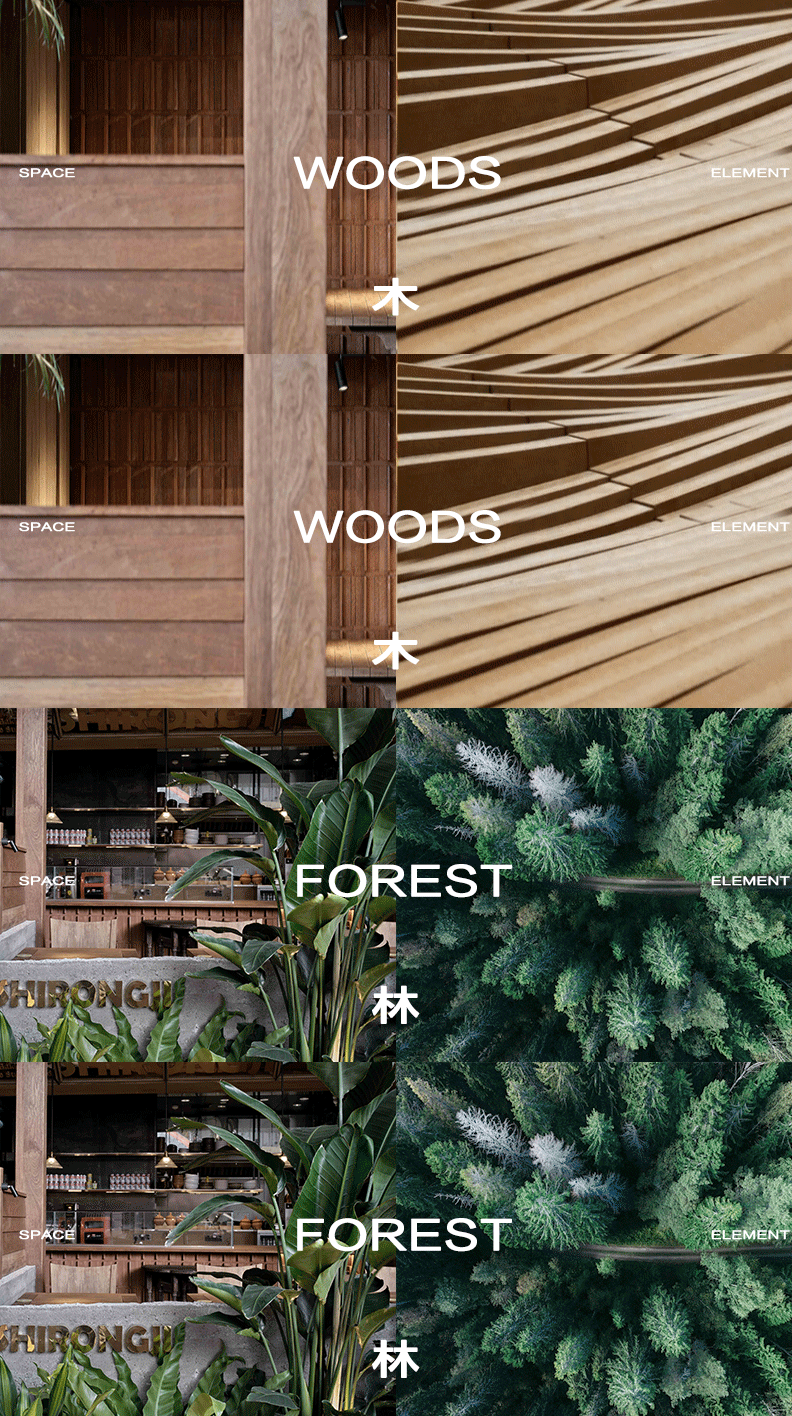
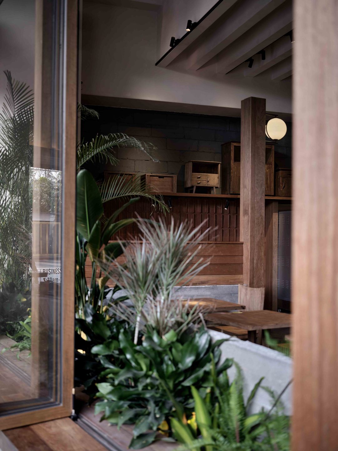
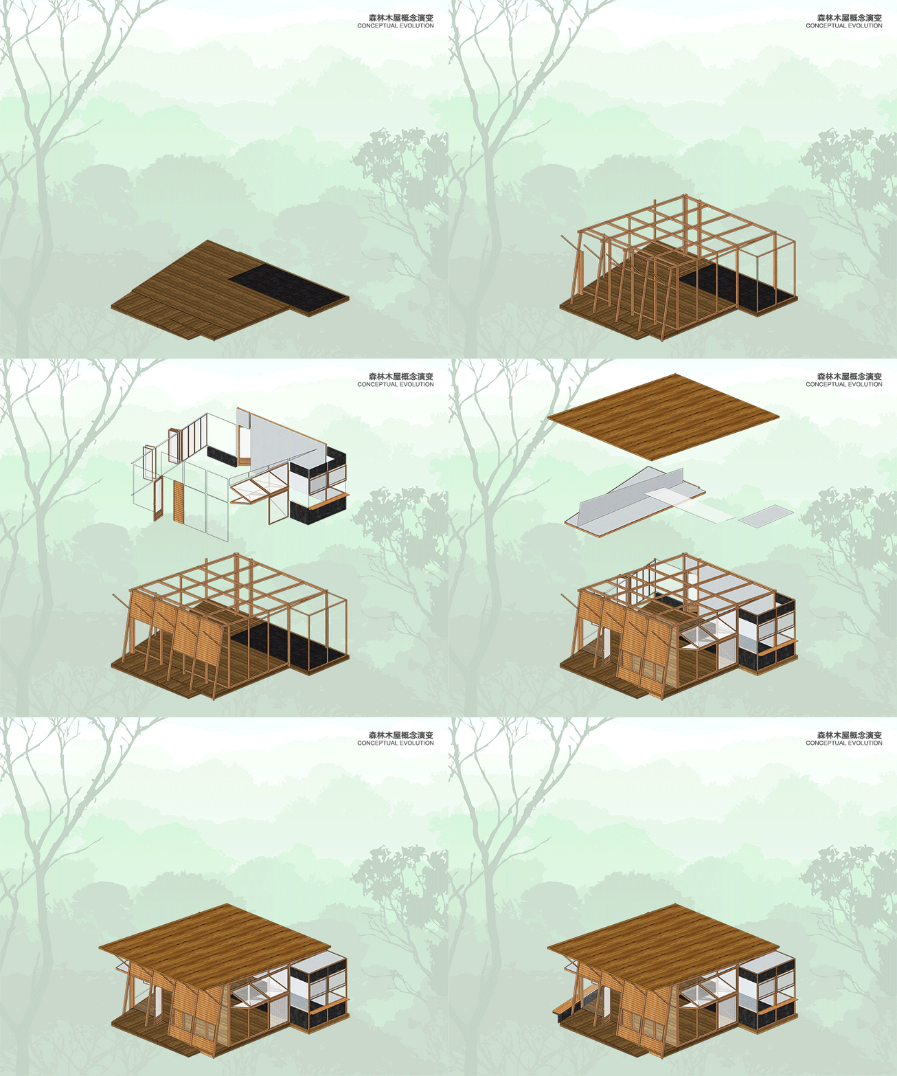
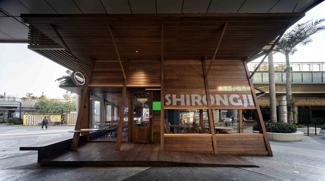
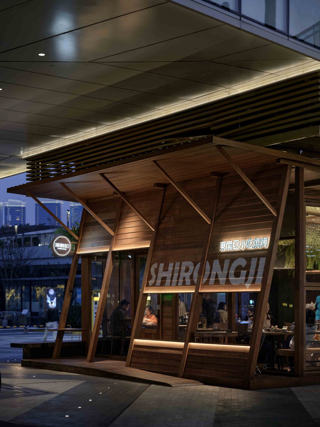
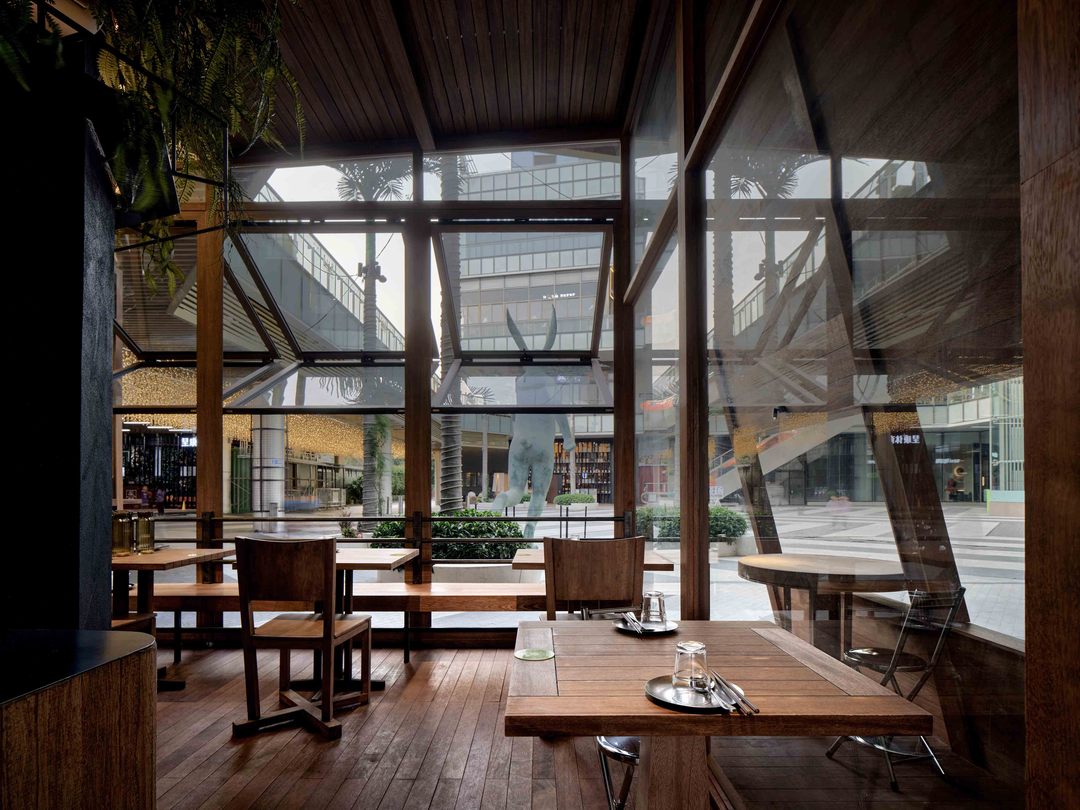
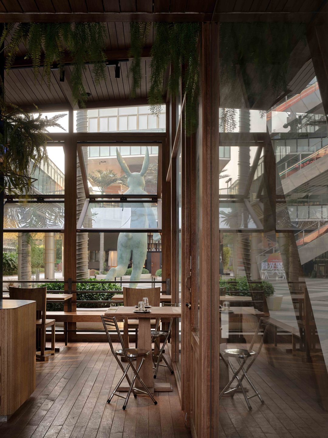
户外区域以“森林木屋”为构思,整体采用全木质框架,东南亚建筑标志性的木质大斜顶,大面积的玻璃折叠窗、整个空间犹如一个半透明的木盒子,从闹市中生长出来。从中冒出影影绰绰的绿植,尽显泰式街头氛围的松弛感、休闲感。空间无界,内外的延伸,将人的感知力无限延展,自由地行走在这城市森林木屋之中。
In contrast to the semi-open state of the interior area, in the design of the outdoor area, the whole space is "open", not separated by substantial walls. With a large area of folding glass Windows and a large wooden slanted roof, the whole space is like a translucent wooden box, from which a lot of green plants emerge, creating a sense of relaxation and leisure in the street atmosphere.
▼户外用餐区域街景
overview of outdoor dining area
▼户外用餐区
overview of outdoor dining area
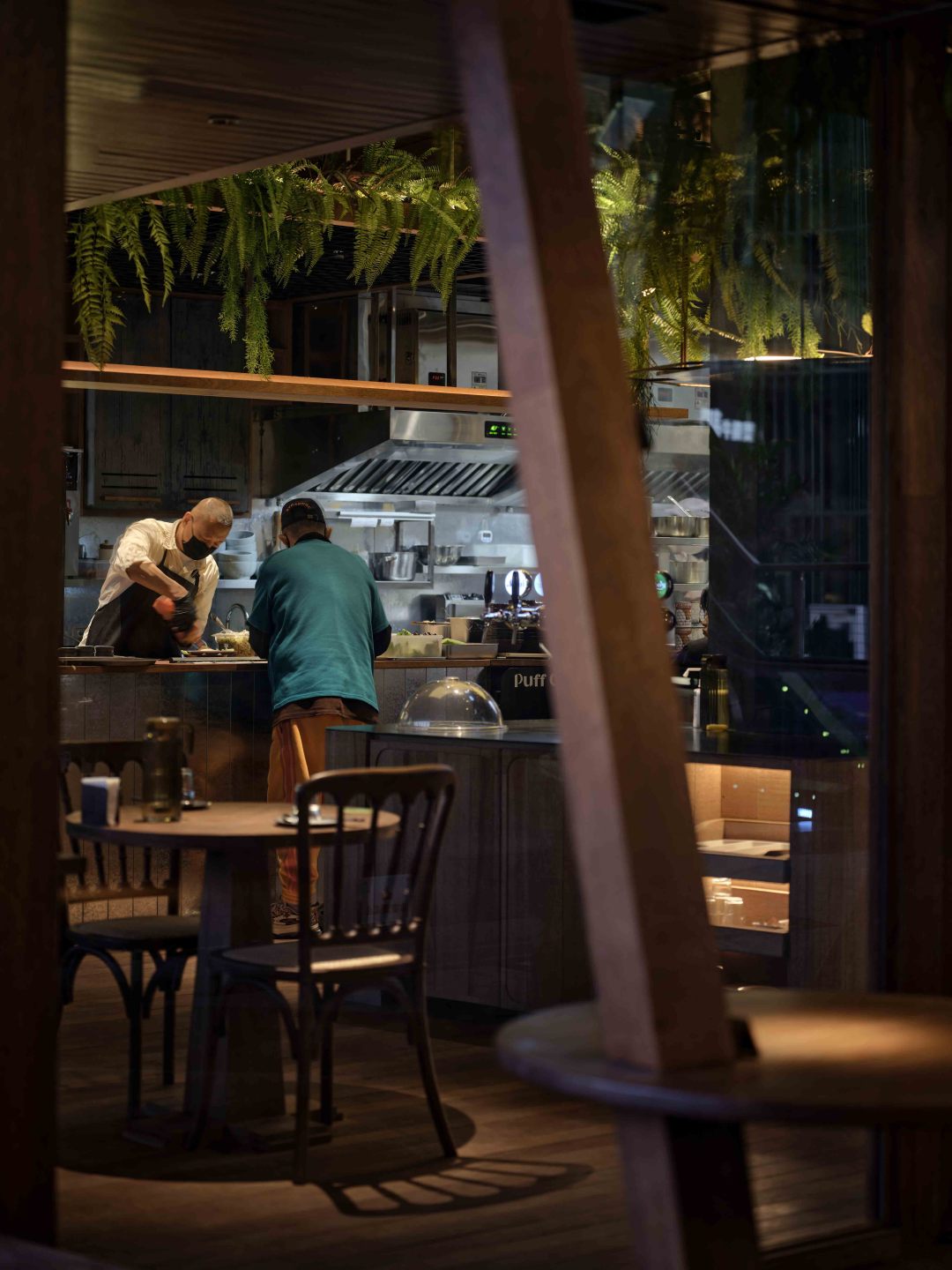
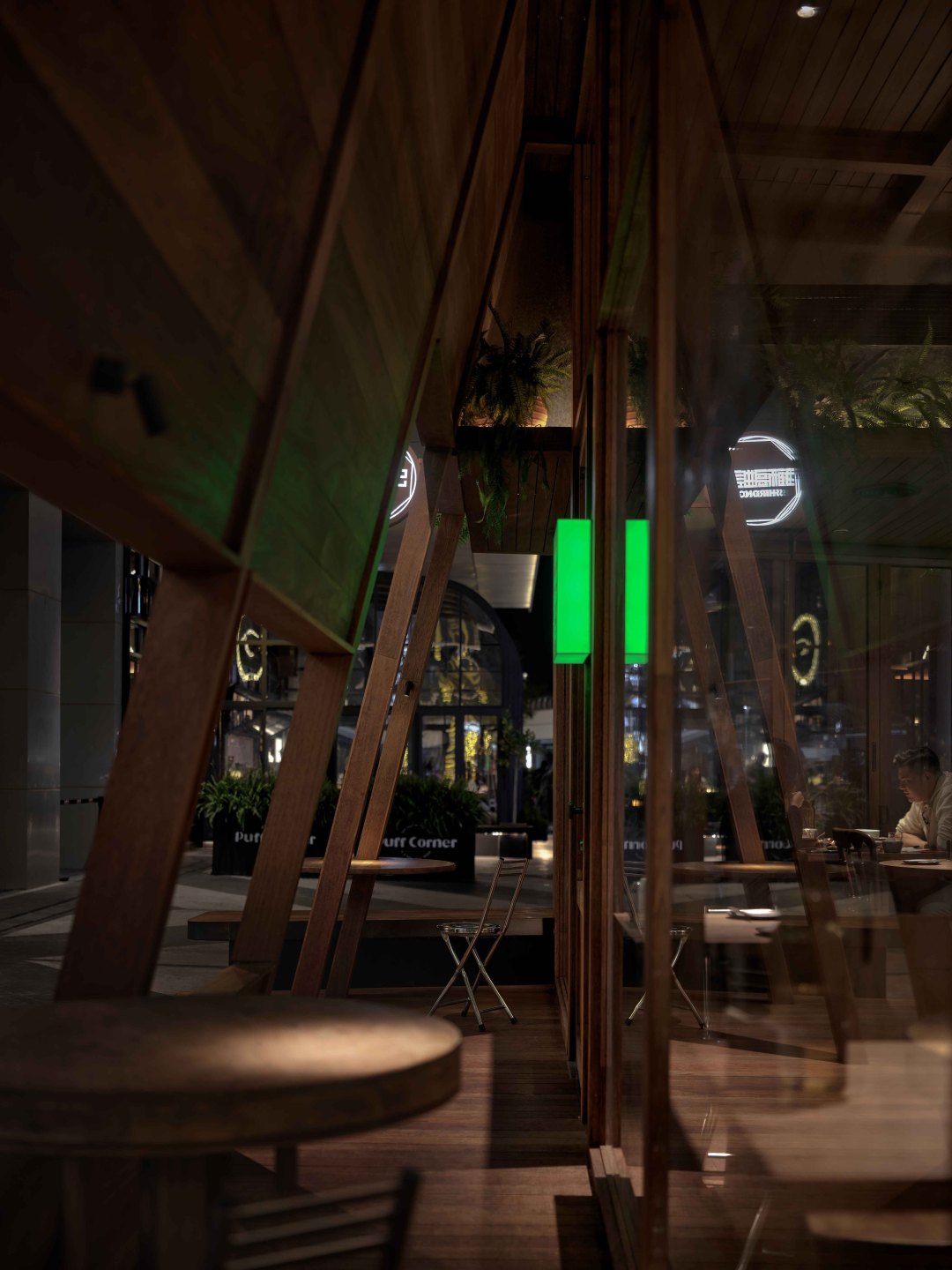
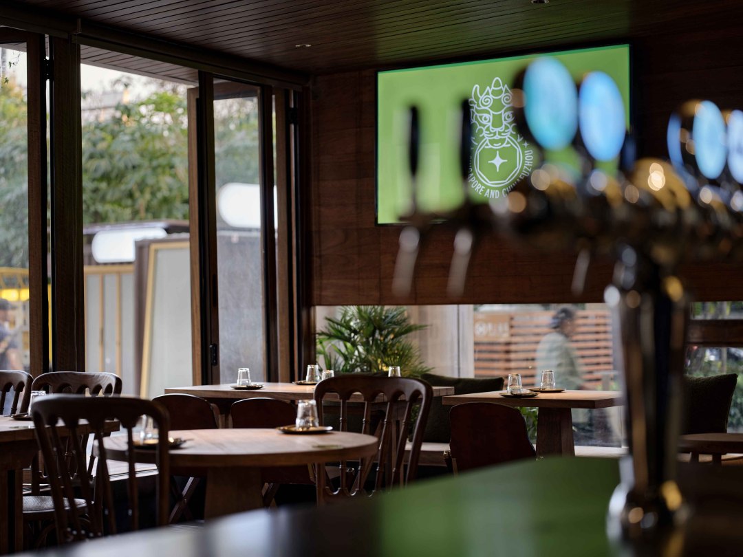
▼从户外用餐区域看下室内区域夜景
Night scene
- - - - - - - - - - - - - - - - - - - -
